You are using an out of date browser. It may not display this or other websites correctly.
You should upgrade or use an alternative browser.
You should upgrade or use an alternative browser.
Nice Upgrade Founder
- Thread starter dillon
- Start date
F
fyrfyter32
Guest
VERY well put together!!!
tx_packmule
Active Member
- Messages
- 805
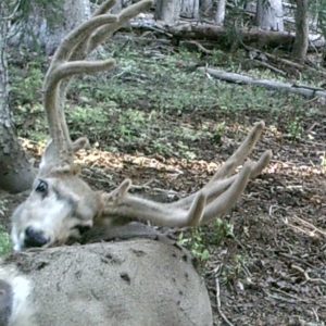
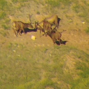
looks good, but the deer keep staring at me as I type.
S
ShowThemToMe
Guest
I doubt any of the PLICKS or DickWeeds are gonna like it!
They got their own little Click!
It's kinda like watching a Nationwide Race,Too FRICKEN many Commercials!
[font color=red size=redsize=18"face"]SHOW THEM TO ME![/font]
If You Love Your Country,SHOW THEM TO ME!
Hot Dog,Hot Damn,I love this Ameri-can
They got their own little Click!
It's kinda like watching a Nationwide Race,Too FRICKEN many Commercials!
[font color=red size=redsize=18"face"]SHOW THEM TO ME![/font]
If You Love Your Country,SHOW THEM TO ME!
Hot Dog,Hot Damn,I love this Ameri-can
Hey Founder,stop being a tightwad and upgrade to UBB...lol

Disclaimer:
The poster does not take any responsibility for any hurt or bad feelings. Reading threads poses inherent risks. The poster would like to remind readers to make sure they have a functional sense of humor before they visit any discussion board.
Disclaimer:
The poster does not take any responsibility for any hurt or bad feelings. Reading threads poses inherent risks. The poster would like to remind readers to make sure they have a functional sense of humor before they visit any discussion board.
never_catch
Long Time Member
- Messages
- 4,681
Someone should tell Kilo the secret to change it back to classic mode...
~Z~
PS...I recently changed my signature because I want you to all know I think you're a
~Z~
PS...I recently changed my signature because I want you to all know I think you're a
LAST EDITED ON Mar-11-12 AT 01:20PM (MST)[p]Sorry, I have to go with Kilo and the other guys in that now the screensize is so downsized for the Forums and the font in the posts is downsized where it is getting too small. I would prefer that the advertizing on the left be removed so we can get back to a full width screen and it's now also much harder to shift from one Forum to another. As for never_catch, it looks like since calling me that last night that he's fallen in love with his new "weed", LOL!
greatwestern
Very Active Member
- Messages
- 1,101
Yuck...I hate it even more than the page resetting Silverado pop up
H
hunt4130
Guest
im liking it as well.
>I'm still toying with it all.
>
>
>Brian Latturner
>MonsterMuleys.com
Careful! you'll go blind...
Disclaimer:
The poster does not take any responsibility for any hurt or bad feelings. Reading threads poses inherent risks. The poster would like to remind readers to make sure they have a functional sense of humor before they visit any discussion board.
>
>
>Brian Latturner
>MonsterMuleys.com
Careful! you'll go blind...
Disclaimer:
The poster does not take any responsibility for any hurt or bad feelings. Reading threads poses inherent risks. The poster would like to remind readers to make sure they have a functional sense of humor before they visit any discussion board.
ditchparrot
Active Member
- Messages
- 124
I don't like the deer staring at me either, they look photoshop plus the right one has a close eye on every word I type..would be more rad if it was a natural scene with deer in it.
Just my two cents.
Just my two cents.
arnold_jeremiah
Active Member
- Messages
- 108
The site looks good to me. I don't think the size is that much smaller but i'm on a wide screen desk-top.
AWHOLELOTTABULL
Long Time Member
- Messages
- 4,357
How about an app for my iPhone?
It's always an adventure!!!
It's always an adventure!!!
E
elkun
Guest
way to many adds , makes a guy not look at any of them.
treedagain
Long Time Member
- Messages
- 6,540
looks good...maybe downsize the adds a bit, other than that good job
How to start an argument online:
1. Express an opinion
2. Wait
How to start an argument online:
1. Express an opinion
2. Wait
Paul_Crawford
Long Time Member
- Messages
- 3,578
I don't like it at all. It wasn't broke so why fix it? pc
Founder
Founder Since 1999
- Messages
- 11,471
I understand about the ads, but until I start crapping hundred dollar bills, they need to exist. BTW, although it will hurt, I would be happy to crap rolls of one hundred dollar bills even.
When we get there, I'll turn the site over the Bessy and Stinky. LOL
Seriously, I will look at going to a more narrow ad on the left side, but...........
AND finally, I'm still working on little issues here and there.
Brian Latturner
MonsterMuleys.com
When we get there, I'll turn the site over the Bessy and Stinky. LOL
Seriously, I will look at going to a more narrow ad on the left side, but...........
AND finally, I'm still working on little issues here and there.
Brian Latturner
MonsterMuleys.com
califhuntn
Active Member
- Messages
- 792
I like the change. Nice job founder.
JR
JR
one_dryboot
Long Time Member
- Messages
- 5,105
I understand the need for adds but good hell dont cram it down our throat! its way too busy and the pop up adds suck. Tone down the adds!
TopGun said,
?I'll get used to the way it is, but truthfully I'm with a lot of the other guys on liking the old way better.?
Hey TopGun, I thought you were a lot tougher than that! What the heck happened to the Mikey I know that easily and spontaneously overcame and adapted?? Seems I recall you were witnessed adjusting to a situation with your quick and keen resourceful imagination with a Wal Mart bag and had no complaints, What gives, you getting old? Ha ha ha LMAO!!
Brian, nice work but I have to agree with some here that the ads are a little too wide. I don't mind them where they are just if they were cut down a little more leaving more room for the forum. Another suggestion might be to move the ads to the other side. It might help to like the forums in the left hand side and ads on the right. Just that little change may make a big difference.
GBA
I think it is def an upgrade from what was here before. The ads were here before as well, just in different places. This site wouldn't be here if it weren't for ads. Running and maintaining a site like this is expensive. It will just take a bit to get used to. I feel like the forum is too far to the right, but I'm used to looking center screen. Overall an improvement though.
WYmoose
WYmoose
C
cowboy57
Guest
Why Why Wasn't wrong with the old page this sucks.the is so small i need different glases.I Hate Change.cowboy57
grizzmoose
Very Active Member
- Messages
- 1,023
I think it looks good. Much more modern appearing and feels professional. Ads are part of the internet and put food on the table. Put 'em where you want. If you are going to do anymore fooling around, maybe you can find a way to hide certain forum members.
LoveBigRacks
Active Member
- Messages
- 311
I don't like the new format, the reason I liked this site in the first place was it's simplicity. At least the forum pages are still easy to get to.
If the change is to keep advertisers happy, why are you wasting half of every page for a brown background with two buck pictures??? If you remove this new background you have twice as much space to use for ads or the forum page. Shaking my head..... There are enough buck pictures to view on the site, don't need them taking up 50% of every page. Please explain Founder.
LBR
Guess I am going to sound like a broken record, but move the advertisers to the RIGHT SIDE OF PAGE. I, along with others find it anoying having to drag the forums over to the right to view and read along with replying to threads. With them in that order there would be no need to drag to read and/or reply.
That's my nickle on this new format and what I think of it.
Brian
http://i25.tinypic.com/fxbjgy.jpg[/IMG]
That's my nickle on this new format and what I think of it.
Brian
http://i25.tinypic.com/fxbjgy.jpg[/IMG]
Founder
Founder Since 1999
- Messages
- 11,471
20% of visitors view this site at 1024 pixels wide or less, so the site was set at 1000 pixels wide. The deer you see on the sides is a background image, nothing more. I thought about just a solid color, but kind of liked the monster muleys on each side. You know, cause of the site being called monster muleys and all.
I've been thinking over the past couple of days of increasing the width of the site another 200 pixels, or 20%. It would mean that 20% of site visitors would need to scroll right to see some content though. Not sure about that. Scrolling side to side REALLY sucks, more than seeing large chunks of background image as some of you are seeing.
As for ads in place of the deer on either side, I may very well pursue a sponsor to there. I don't know.
As far as complaining that there are already enough buck pictures on this site, you're crazy. There can never be enough!!! When people visit this site, I want them to feel surrounded by big bucks, big bulls, etc. When someone looks at this site, I want them leaving with an incredible desire to go hunting.
Anyway, if you've read this far into my post, then you must be really bored. Ha Ha Seriously, I'm still kicking around thoughts on the look of the site. I've heard LOTS of opinions, and they're all over the place, so..........
The fact is, the main content portion of this site is larger now than it was before. The width increase allowed for wider ads, but wider main content area also. Proportionally however, the ads did increase because I moved them from the bottom of the page to the side.
Fact is, the ads are needed. And not only needed, but needed in a manner that visitors see the them. Without the ads, I would have to get a job and shut the site down. I need the visitors of this site to see the ads, and hopefully consider purchasing product or service from the advertisers. It's that simple.
Look at this, I just wasted 10 minutes explaining all this stuff to you all when in the end, many still won't understand or care. If you read this far into my blab session then you're on this site for the wrong reason anyway. You should be here to talk and think about big bucks and bulls, and hunting, and all that. NOT to discuss the size of ads, and what's on the side, and all that crap. I do the best I can to make this site the best I can with my limited resources (financial and otherwise).
Yes, I have heard people say, "well can't you just do this or that like Facebook". Do people not know that Facebook has about 3,000 more employees than MonsterMuleys.com and probably a ZIG ZILLION more dollars. Of course I want the greatest site on the planet, but such a thing doesn't come out of thin air.
So that's that. Now I'm at 15 minutes of the day wasted. LOL I gotta get work done.
Brian Latturner
MonsterMuleys.com
Being retired with plenty of time to look at all the bucks an bulls, I also had time to read your ENTIRE post! I was bascially negative on the new format and was of the "when it ain't broke" mentality, but I've already adjusted to the new format and, by golly, I'm still alive and breathing. Keep up the good work because between this site and the OYOA that Randy runs, you guys are the best out there, bar none! Good luck on into the future, as I sure don't want you to have to go to work for a living!!! Just kidding!
LoveBigRacks
Active Member
- Messages
- 311
Founder,
It's late and I am bored, but I read your response because you took the time to write it and I was genuinely interested in your response. I hadn't considered the fact that others view the site differently than I with pixels count / screen size differences. That said, I'm not sure why you'd cater to a 20% minority rather than the majority but perhaps the size/pixels are all over the map and 20% is the majority. Funny enough, my original reply was from my work computer and here on my iPad I don't see the deer background.
I certainly didn't mean to "complain" there were too many buck pictures on here, I think the two bucks on the screen were really starting to get on my nerves at that point. I love the buck pics and the more the better!. The ads don't really bother me, they don't get in the way and they're necessary to keep the site alive....plus there's some great advertisers on here, some with discounts for MM members.
I completely understand and appreciate your response. It may seem trivial but the format of the site is a huge reason for the number of visitors and I'm glad it hasn't changed drastically. Thanks for the feedback and thank you for this site!
LBR